Apr 14, 2022
Designing dark mode without the headaches
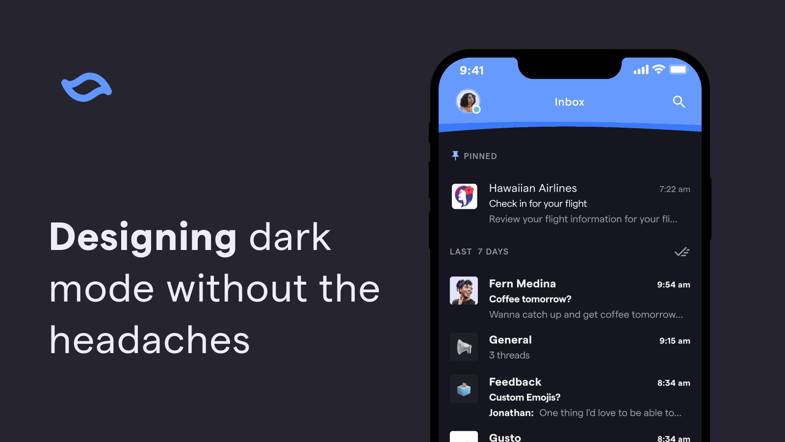
We always knew we wanted to build dark mode for Shortwave, but it didn't quite make the cut for launch. Post-launch, emails flooded our support inbox with subject lines like "HELP, MY EYES" 😵💫🙈 The time to build dark mode had finally arrived!
The project initially felt a little daunting, since a high quality dark mode is much more complex than inverting colors. We needed to consider details like contrast and readability while keeping our design feel on-brand with a completely different theme. Shortwave was designed to be fun, joyful, and calm and we didn't want to lose that with the introduction of dark mode.
We knew that an efficient approach to dark mode was the key for our small team. We didn't want to spend the time designing every flow or screen twice and similarly wanted to avoid doubling the engineering effort needed to implement them. Now that dark mode for Shortwave has officially launched (yay!) – I'm excited to share some of the takeaways we learned in the process that helped solve some of our headaches (figuratively and literally).
Double the design without double the work
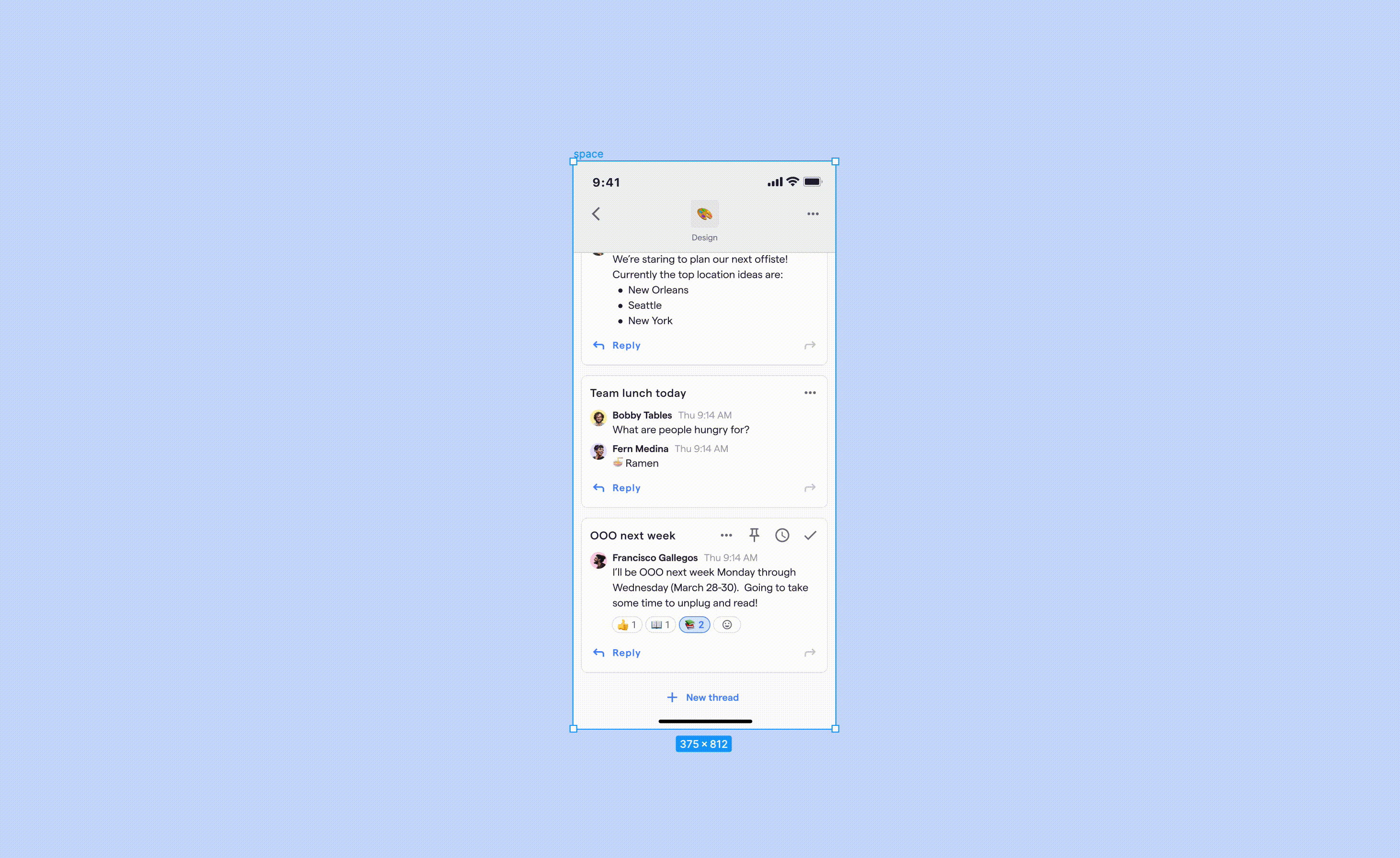
Using the Themer plugin in Figma to convert from light to dark mode in just a few clicks
One of our biggest challenges with dark mode was figuring out how to introduce it to our design system without slowing down our design process (especially because we currently have a design team of one - we're hiring by the way)! Designing things twice was out of the question and we knew requiring every Figma component to have a dark mode variant would lead to extra upkeep. Our goal was to create an automated system that matched how it actually works in code, with occasional overrides.
Enter Themer — a Figma plugin that creates and swaps themes from published styles. After taking our existing light theme and assigning corresponding dark mode colors, all we have to do to convert a mock to dark mode is run the plugin. It's magical ✨
So far, Themer has been working great for our team. The only hiccup we've experienced is that it can lead to issues with overrides. Converting an instance of a component from Light → Dark → Light, ends up with something that looks like it matches the main component, but all the colors are actually overrides. It hasn't been a huge issue yet and our workaround has been to only use Themer to convert from Light → Dark and not the other way around.
Name colors based on how they're used, not how they look
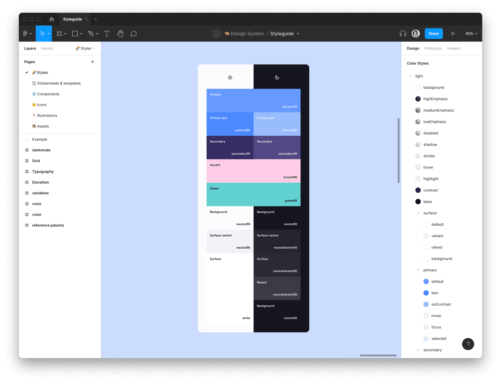
An example of some of our color naming and pairings in Figma
Naming is hard – naming colors is even harder! We knew a naming system that simply described the hue or value of the colors would quickly get confusing when transitioning from light to dark mode. For example, something named darkGray may make sense in light mode, but would be confusing in dark mode where it would actually be a light gray.
Our solution was to name colors based on semantic usage. Referencing Material Design's naming approach (see M2 & M3 color guides), our existing light theme consisted of primary, secondary, and accent colors, with variations for text and structural elements such as background, highEmphasis, mediumEmphasis, disabled, and hover.
Some of the color names were intuitive, while others were a bit trickier. Surface colors proved to be the hardest to wrap our heads around. In light mode, they were all whites with different shadow depths, but dark mode needed more variety because you can't see shadows in the dark. We ended up with four different surface colors including surface, surfaceVariant, surfaceRaised, and surfaceBackground to meet all our needs and then grouped these together in our Figma styles to make them easier to choose from.
With a defined set of colors based on their usage, we were ready to create our light / dark mode pairs needed for the previously mentioned Themer plugin. This naming system not only made creating dark mode a lot easier, but also set a solid foundation for any other theming we decide to add in the future, such as high contrast or custom themes.
Don't be afraid to use your design eye (this isn't a formula)

How we expanded some of our brand colors (outlined in white) and tweaked the tonal HSL (Hue-Saturation-Lightness) palettes to be more on-brand (top vs bottom)
One of the easiest ways to extend a single brand color to work across light and dark themes is to make a tonal HSL (Hue-Saturation-Lightness) palette by adjusting the lightness from 100 to 0, making your color go from white to black. This is the general approach Material Design takes as well. There's even a Figma plugin that will create these for you. These tonal palettes were a great place to start. However, being more mathematically derived, they missed the mark. Design is an art after all, not just a science!
Starting with HSL tonal palettes derived from our brand colors, we manually adjusted some values to better align with our established style guide. We started with slight adjustments to saturation first. If that didn't cut it, we tweaked lightness next and then finally hue. For our blues and purples, we lowered the saturation to maintain our calmer palette. Our yellows were changed most drastically, as we adjusted hue, saturation and lightness across the palette to keep it cheery and avoid muddiness. Although small, these subtle tweaks make a huge difference in conveying the same mood across light and dark modes.
The colors in these reference palettes were the source of all our color variables, acting as design tokens to define all of the semantic colors used in our themes. For example, our secondary color variable is purple30 (light mode) and purple40 (dark mode) from our reference palette. This type of system makes it easier to make fine-tune adjustments across your entire app and themes because everything points back to a single cohesive set of color palettes.
Speak the same language as engineering
With a relatively small team and a lot to get done, we needed to make the workflow between design and engineering as seamless as possible. To do this, our design approach for dark mode needed to match how it's actually built in code as much as possible.
Thankfully, long before we started building dark mode, our proactive engineering team made the decision to use styled-components and its theming functionality. Similar to our design approach in Figma, we leveraged this theming functionality instead of having to build a dark mode variant for each component. This meant our code worked similarly to the Themer Figma plugin, where colors could be light and dark mode aware.
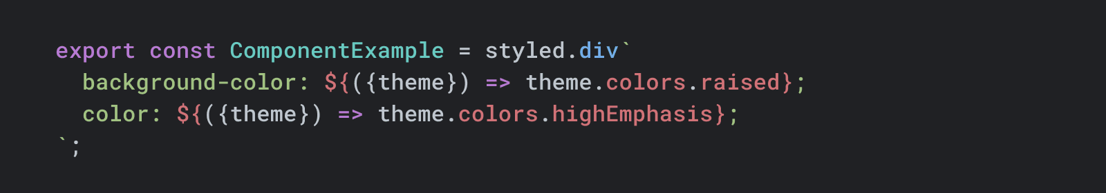
Colors are light and dark mode aware with styled-components theming functionality
We also introduced CSS variables (aka CSS custom properties) to our codebase to allow easier referencing between designs and code. Browsers do a great job of exposing CSS variables, allowing you to see them when you inspect elements in the developer console and even easily switch from one variable to another.
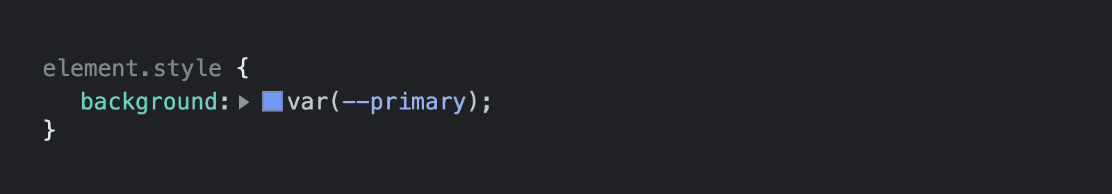
CSS variables are a lot easier to inspect and verify in the browser for engineers and designers alike
Mapping our design and engineering systems together saved everyone time and kept our cross-functional team aligned. Engineers could verify that they were using the right color variable in Figma, and I could double check that the correct color was being used during code reviews. Everyone was on the same page!
Introducing dark mode to Shortwave
While this project was far beyond "switching out a few colors," all of the hard work designing dark mode was more than worth it. We now have a system in place that allows dark mode (and any other future themes) to easily grow with Shortwave and its new features — without needing extra design and engineering work.
We officially shipped dark mode to users last week and we've loved watching everyone find yet another reason to enjoy their inbox with Shortwave!
We're hiring
Ready to take on fun projects like dark mode with the Shortwave team and enjoy other awesome perks like flexible remote work, competitive compensation, and regular offsites (places like Hawaii, Miami, and New Orleans)? We are hiring designers and engineers. Check out our open positions and apply today!
📣 Join us live on Thursday, April 21st at 2PM PST
Get your questions answered directly by our team during a live tech talk on Twitter (set a reminder). Send us your questions in advance with #AskShortwave or chat with the team live.
Sign up for monthly updates
Get a roundup of the latest feature launches and exciting opportunities with Shortwave